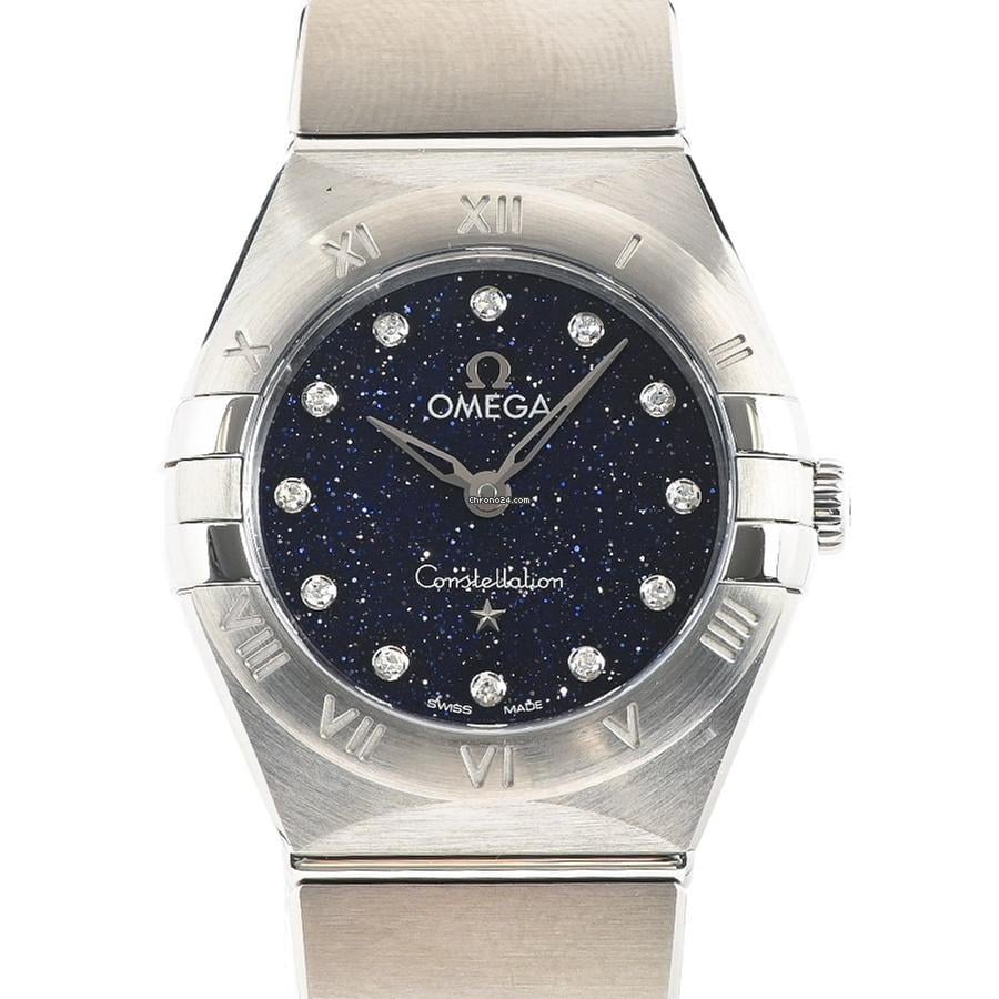
The Omega Constellation offers a different kind of presence from the brand’s dive watches and chronographs. Its identity comes from case shape, dial detail, and the way the bracelet meets the watch. Manhattan and Globemaster designs take that identity in different directions, so a useful comparison begins with the exact style rather than the Constellation name alone.
Two design traditions within one collection
The Constellation began in 1952 with a focus on precision timekeeping. The later Manhattan design introduced the distinctive claws at the sides of the bezel, creating a silhouette closely associated with the collection. The observatory medallion and star motif are other recurring parts of its visual story.
The Globemaster takes a different approach, drawing on earlier dial forms and pairing them with a fluted bezel. It should not be treated as a Manhattan with a different dial. The case, bezel, and bracelet or strap arrangement give it a separate character.
| Design | Defining details | What to inspect |
|---|---|---|
| Manhattan | Bezel claws and an integrated-looking case-to-bracelet transition | Symmetry, claw shape, and the fit of the first bracelet links |
| Globemaster | A fluted bezel and pie-pan-inspired dial | Bezel consistency and the definition of the dial’s different surfaces |
The Manhattan’s claws and bracelet
The claws should appear balanced across the bezel, with clean edges and a finish that belongs with the surrounding case. Their shape affects the watch’s outline from a distance, while their execution becomes more apparent in close-up views.
The bracelet is equally important to the overall design. Look at the transition from case to first link, the consistency of the link spacing, and the taper toward the clasp. A bracelet that looks close in a photograph may still feel stiff or fit poorly, so ask about adjustment and available links.
Globemaster dial depth
The Globemaster’s pie-pan-inspired dial uses changes in surface angle to create depth. The effect should remain readable rather than appearing like an arbitrary raised ring. Angled photographs help show how the dial catches light and whether the hour markers sit consistently around it.
A fluted bezel also makes uneven machining or finishing more noticeable. Compare the regularity of the ridges around the entire circumference. Original-model testing or certification language should be kept separate from the description of a replica; decorative inscriptions do not establish equivalent performance.
Steel, two-tone, and dial color
Silver and gray dials tend to emphasize the shape of the case and bracelet. Blue and green add more visible color, while champagne tones can connect the dial to gold-colored details. None is automatically the most accurate choice across all replicas: photographs and specifications should relate to the item being offered.
Two-tone versions require a clear explanation of their materials. A gold-colored coating, gold-plated component, and solid precious-metal part are different things. Ask which surfaces are coated and how the seller describes ordinary wear, rather than assuming the construction from an original Omega reference name.
Finish with practical checks
Confirm the actual diameter, thickness, movement type, and date function where fitted. A quiet dial makes crooked markers, rough hand edges, or a poorly centered date especially visible. The clasp should close securely and allow a fit that keeps the case centered on the wrist.
For a sportier Omega design, compare the Seamaster guide. To explore a chronograph instead, read the Speedmaster guide or browse the complete Omega collection.