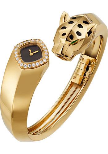
The Panthère de Cartier is as much about the bracelet as the watch itself. Its compact square case, rounded corners, Roman numeral dial, and closely linked bracelet create one continuous piece. When comparing replicas, the way those elements fit and move together matters more than a simple front photograph or a broad quality label.
The design that made the Panthère distinctive
Introduced in 1983, the Panthère brought a jewelry-like approach to Cartier’s watch design. The small case sits within a flexible sequence of polished links, allowing the bracelet to carry much of the visual character. That balance sets it apart from the more rectangular Tank and the more visibly sporting Santos.
The case corners should be softly defined rather than abruptly square. Look at the relationship between bezel width, dial opening, and bracelet. If any one element is too heavy, the design can lose the light, connected appearance that makes the Panthère appealing.
Small differences in size make a big difference
Mini, small, and medium descriptions are useful starting points, but they should be supported by measurements for the actual replica. A compact square watch does not wear like a round case of the same width. Overall length, thickness, and the first bracelet links all contribute to its presence on the wrist.
Choose the proportion you prefer rather than assuming a size belongs to a particular gender. A smaller case emphasizes the bracelet, while a larger version gives the dial more prominence. Ask about the minimum and maximum bracelet circumference, removable links, and whether spare links are available before deciding.
The bracelet deserves its own inspection
Look for links that sit evenly and articulate smoothly. A photograph of the bracelet resting naturally can reveal how it curves, while a short handling video can show its movement. The connection to the case should feel visually continuous, without distracting gaps or a sudden change in scale.
Inspect the clasp and underside as well as the polished front. The clasp should close neatly, and the links should have consistent edge finishing. A rigid display photograph can hide these details, so request views that show the bracelet open and relaxed rather than only wrapped around a stand.
Dial, hands, and crown
The Panthère’s dial uses a relatively small area, making printing quality important. Check the Roman numerals, minute track, and Cartier text for even spacing and clean edges. The hands should have a consistent shape and finish, with clear separation from the background.
The blue cabochon-style crown is another recognizable detail. Its color and seating can be assessed visually, but its material should come from the listing’s specification. A decorative signature within a numeral, where appropriate to the reference, is a design detail rather than evidence that a replica is authentic.
Quartz movements and surface finishes
Quartz is a common configuration in Panthère replica listings. Ask which movement is installed and confirm the setting behavior. A quartz mechanism does not remove the need to inspect hand alignment, dial clearance, and the condition of the crown. The specific watch’s construction matters more than a generic movement label.
Steel, gold-tone, and two-tone versions change the overall effect. For coated finishes, request a clear description of the base material and coating rather than relying on terms such as “wrapped gold.” Inspect color consistency across the case, links, crown, and clasp. A gold-colored surface should not be confused with solid gold.
Panthère or another Cartier?
The Panthère places the bracelet at the center of the design. The Tank emphasizes a rectangular case, while the Santos uses exposed screws and a stronger geometric outline. Compare the Cartier collection at Beasts.us.com to see which balance of case and bracelet suits your preference.